
Run the Group Performance (Phishing Trendline) report
Track one group's phishing resistance month by month, with a trendline, best and worst month callouts, and a sortable monthly breakdown.
The Group Performance report shows whether one team is actually getting better at spotting phishing. It rolls every test the group has taken into a month-by-month trend, flags their best and worst months, and breaks the numbers out in a table. Run it for a department, a location, an exec group, or any pilot cohort you are tracking.
The catalog card is called Phishing Trendline. Once you pick a group, the page is headed with that group's name. It is the same report.
Pick a group
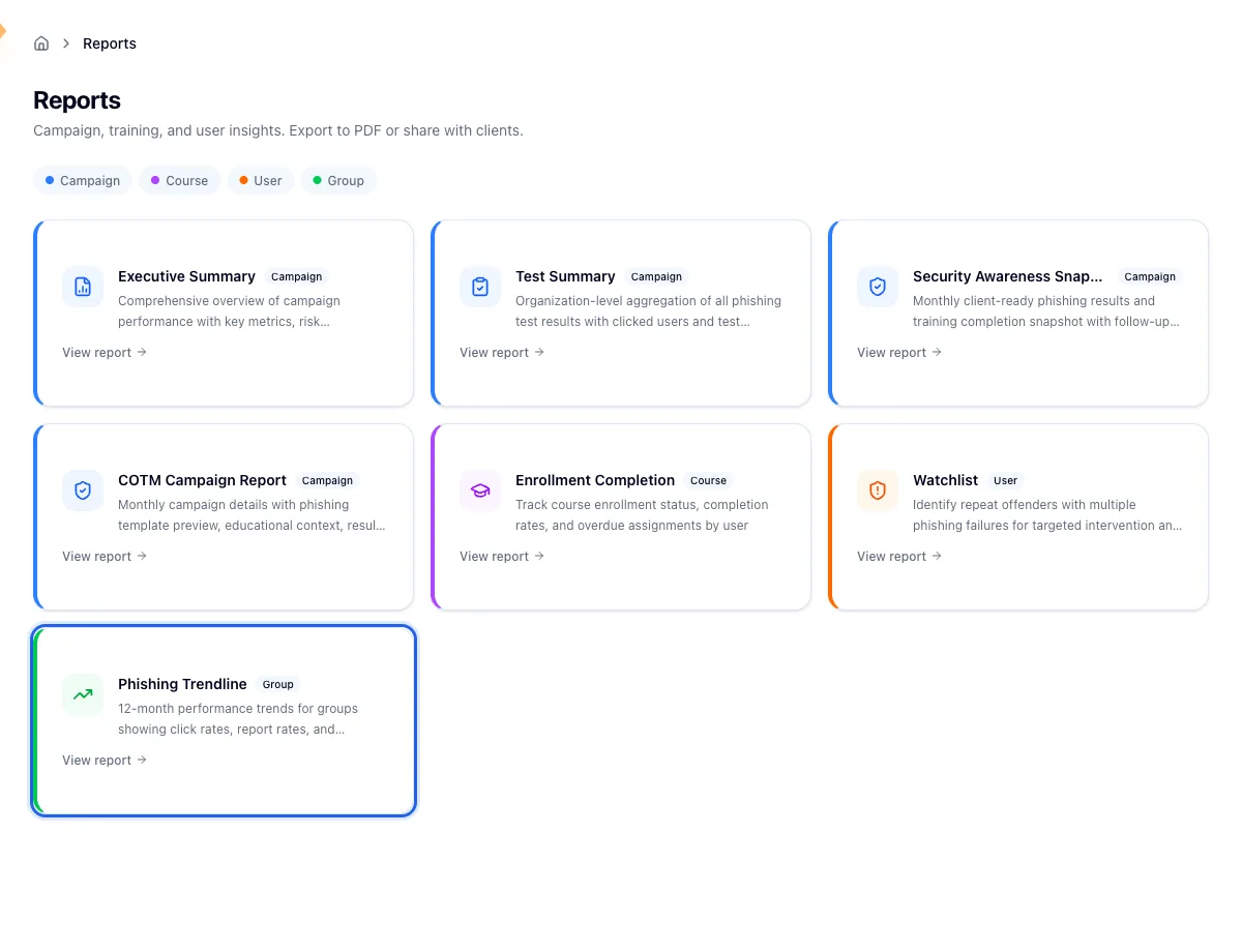
Open Reports in the sidebar and choose Phishing Trendline under the Group category. You land on Group Reports, a table of every group in the selected organization with its member count and how many phishing tests it has taken.
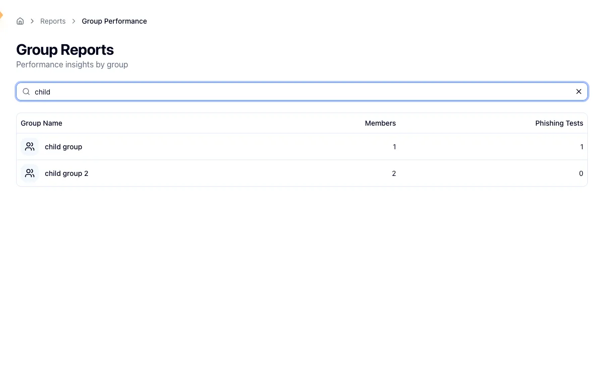
Search by name to filter the table, then click a row to open that group's trendline. The trend is built entirely from phishing results, so a group that has never been included in a campaign has nothing to plot and you get an empty state instead of a chart. Widen the date range first, and if that changes nothing, run a campaign against the group.
Read the report
Best and worst month
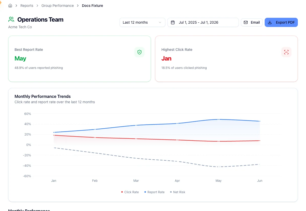
Two cards at the top name the month with the group's highest report rate and the month with its highest click rate, each with the percentage behind it. Both are picked from the same monthly data as the chart, so they always fall inside the range you are viewing.
The trendline
Monthly Performance Trends plots three lines: click rate, report rate, and net risk, which is click rate minus report rate. Net risk is the one to watch, because it captures the gap between the people who fall for a simulation and the people who flag it. A group whose click rate is flat but whose report rate is climbing is still improving, and the net risk line is where that shows up.
Rates are worked out against how many people the tests targeted that month, which is what the Delivered figure counts. It is not a confirmation that each message reached an inbox. A month with nothing sent reads as zero.
The line under the title tells you the window you are looking at, and when the data starts or stops inside that window it says so. That is how you tell a quiet month at the edge of the range from a gap in the data.
Change the range
The report opens on the last 12 months. The date picker in the header offers Last 30 days, Last 3 months, Last 6 months, and Last 12 months, or a custom start and end date. The range lives in the URL, so a link you send carries the window with it.
The monthly table
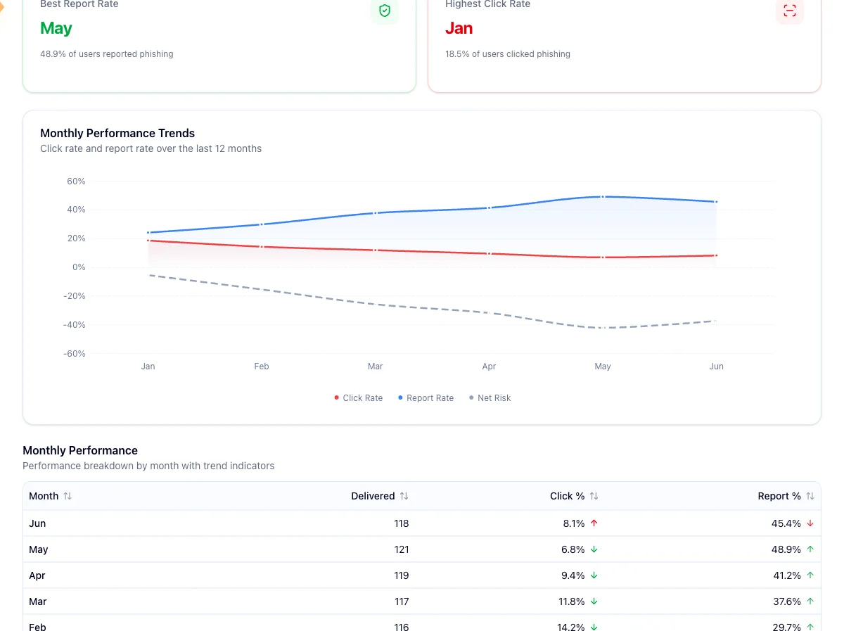
Below the chart, the same data broken out by month, newest first, with Month, Delivered, Click %, and Report % columns. Every one of them sorts.
Click % and Report % each carry a trend arrow against the previous month, and the color reflects the verdict rather than the direction. Down is good on click rate, so a green arrow there points down and a red up-arrow means clicks rose. Up is good on report rate, so a green arrow there points up. A dash means no change, and the oldest row always shows a dash because there is nothing before it to compare against.
Share it
Export PDF downloads whatever range you are viewing. Email opens a picker of users in your organization; choose at least one recipient and Hook sends them the same report.

Related
Review the security watchlist
See which individual people are repeat clickers and need follow-up.
Run the Security Awareness Snapshot
A one-page read on the whole organization's phishing and training results.
Read the executive summary report
Make sense of a single campaign's metrics and recommendations.
Run the Course Enrollment report
Measure completion for a single course, filter by group or status, and find the learners who are furthest past their due date.
Run the Autopilot (COTM) Campaign report
Build a client-ready write-up of a managed Campaign of the Month simulation, with results, the email your users saw, the training video, and an optional list of who clicked.