
Read the org dashboard
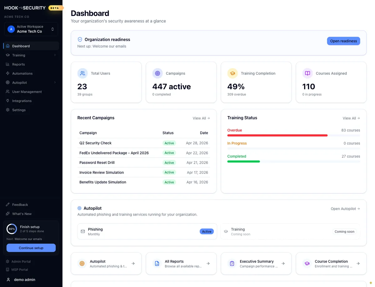
The org home page at a glance: headline metrics, recent campaigns, training progress, Autopilot status, and the shortcuts into the full reports.
The dashboard is the first thing you see after signing in, and it's the fastest way to tell whether anything needs your attention today. Every section links through to the report behind it, so treat it as a jumping-off point rather than somewhere you read numbers closely.
When a number looks off, click into the report that owns it rather than acting on the summary.
The metric cards
Four cards run across the top. Each shows one headline number with a smaller figure beneath it, and the whole card is a link.
| Card | Headline | Beneath it | Opens |
|---|---|---|---|
| Total Users | Users in the org | Number of groups | All reports |
| Campaigns | Active campaigns | Completed campaigns | Executive summary |
| Training Completion | Average completion rate | Overdue enrollments | Course completion |
| Courses Assigned | Courses assigned | Courses in progress | Course completion |
If your organization isn't fully set up yet, a readiness card can sit above these four, listing the steps you still have outstanding.
The campaign counts come from every campaign you have, not just the five listed further down the page, and they follow each campaign's current state, so one that's running counts as active and one that has ended counts as completed. Training Completion averages across all assigned courses, and its icon turns amber as soon as anything is overdue.
Total Users is the only number that includes child organizations
If your account has organizations beneath it, Total Users counts all of them. Every other number on this page, and in every report, covers only the organization selected in the switcher. Don't compare the two directly.

Recent campaigns and training status
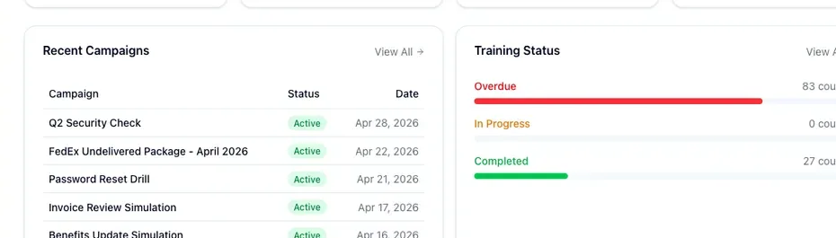
Recent Campaigns lists your five most recent phishing campaigns with a status badge and the date each was created. Click a campaign name to open its executive summary, or use View All to reach the full report catalog. An organization with no campaigns yet gets a short empty state instead of the table.
Training Status sits beside it and splits your courses across three progress bars: Overdue, In Progress, and Completed. Each course lands in exactly one bar. Hook checks completion first, so a course at 100 percent counts as completed even if an enrollment inside it once ran late, then overdue, then in progress. Each row shows how many courses are in that state and how much of the total that represents, and View All opens the course completion report.
These are progress bars, not charts. There's nothing to hover over for a breakdown, so go to the linked reports when you need the detail behind a bar.
Autopilot
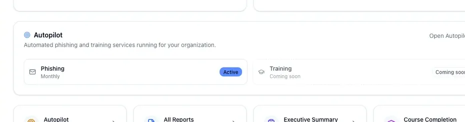
The Autopilot card tells you whether automated simulations are running, with a row for phishing and a row for training. A row reads as active with its cadence (monthly, bi-monthly, or quarterly), paused, skipping the next cycle, or not yet enabled.
Training Autopilot hasn't launched, so its row is marked coming soon and doesn't go anywhere when you click it. The phishing row is the live one: click it to open phishing preferences, or use the link in the card header for the Autopilot overview. See Understand and set up Autopilot for what each setting does.
Quick actions and the FAQ
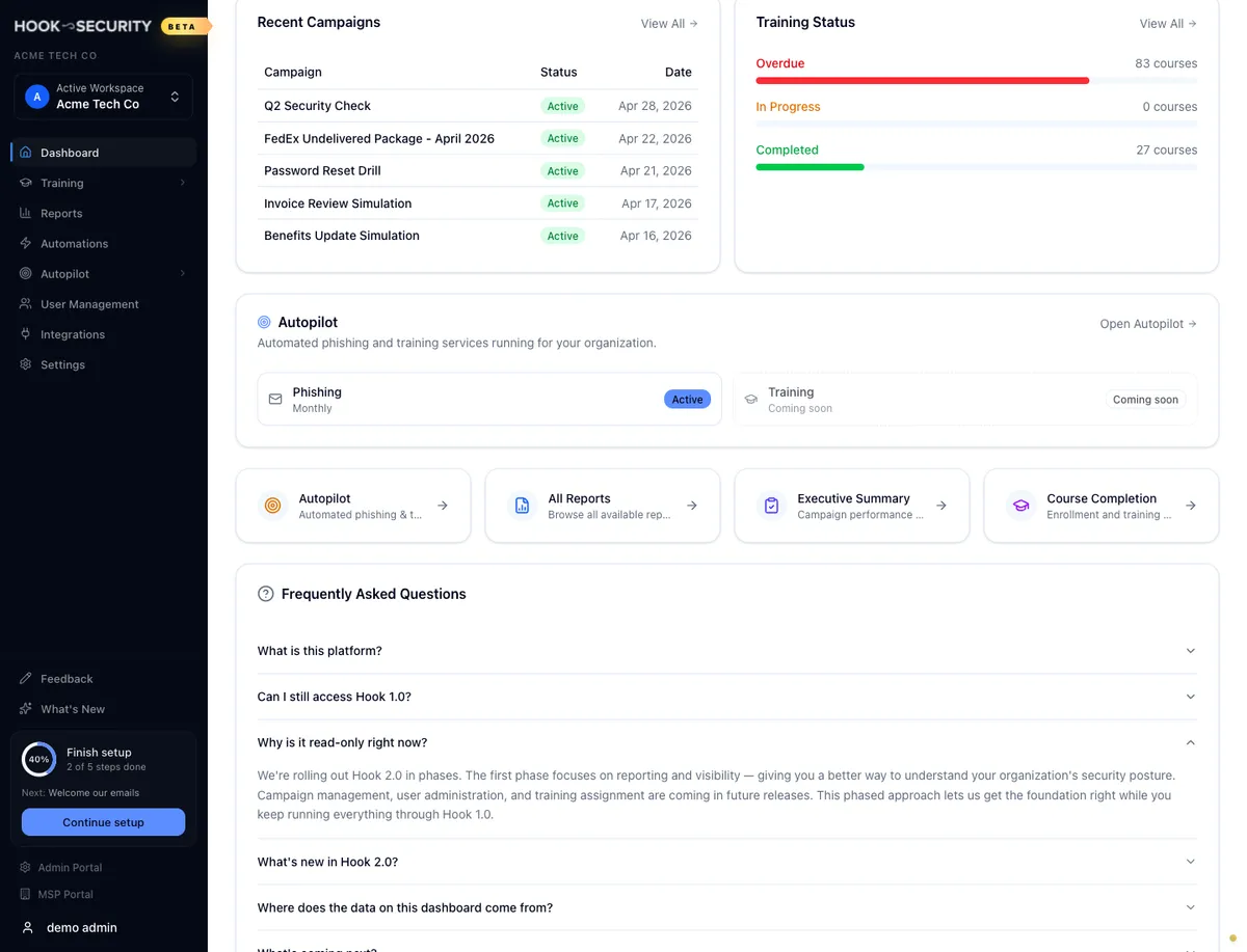
Four quick action cards below Autopilot are plain shortcuts to the Autopilot overview, all reports, the executive summary, and course completion. They point at the same destinations the metric cards do, and they don't change with your numbers.
At the bottom of the page, a Frequently Asked Questions accordion answers what org admins ask most about where the dashboard's data comes from and what you can do from this screen. Expand any question to read the full answer.
When something looks wrong
Reload before you act on a surprising number. The dashboard loads each section independently, so a single slow lookup can leave one card behind while the rest of the page looks fine. If the figure is still strange in the report behind it, contact support.
Switching organizations rebuilds every section, with a brief loading state along the way. If the page still shows the previous org's numbers afterwards, reload. The dashboard always reads whichever organization is selected in the switcher.
An error that replaces the whole page, rather than one card falling back to zeros, usually means your session expired or you don't have access to the selected organization. Re-select your org or sign in again.
The dashboard itself is read only. It's a place to read and to navigate from, so make changes in the section that owns them: campaigns under Simulations, enrollments under Training, people under User Management.
If a number looks like it's lagging behind what you expect, see how this portal relates to Hook 1.0 in the FAQ.
Related
Navigate the org portal
Find your way around the sidebar, the org switcher, and where each section lives.
Read the executive summary report
Open the per-campaign report the metric cards and Recent Campaigns link to.
Track course completion
Dig into the training numbers behind the Training Status card.
Understand and set up Autopilot
Read and configure the phishing engine summarized on the Autopilot card.
Navigate the org portal and switch organizations
Get oriented in the org sidebar and breadcrumb header, and move between the organizations you manage with the workspace switcher.
Run a phishing campaign
Launch a simulated phishing email against your users, choose who gets it and when, and know what to expect after you hit launch.